Creating an Immersive Art Browsing Experience with Astro Collections
How I built a full-viewport, reel-like scrolling experience to showcase detailed artwork while preserving the ability to zoom into intricate details.
Creating an Immersive Art Browsing Experience with Astro Collections
When designing the gallery section of my portfolio to showcase my mother’s artwork, I faced a unique challenge. Her detailed collage work contains intricate elements that would be lost if displayed in a traditional gallery grid with multiple thumbnails per page. I needed a solution that would:
- Display each artwork as large as possible
- Allow visitors to zoom into the fine details
- Create a smooth, engaging browsing experience
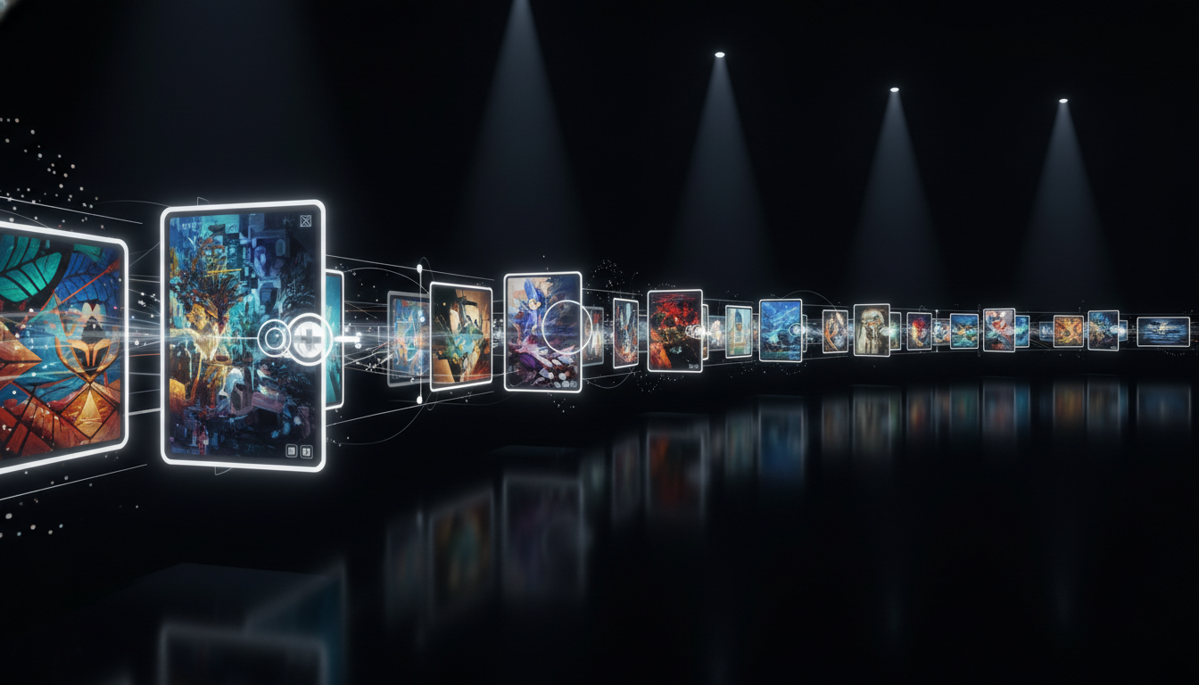
The solution I landed on was inspired by modern content consumption platforms like Instagram Reels and TikTok – a full-viewport, vertically-scrolling experience powered by Astro’s content collections.
Why Traditional Galleries Didn’t Work
Most portfolio sites use a grid layout for gallery items, which is perfect for showcasing multiple works at a glance. However, for large, detailed artwork like my mother’s collages, this approach creates several problems:
- Loss of detail: The thumbnail view robs viewers of seeing the artwork’s intricacies
- Poor aspect ratio handling: Collages often have unique dimensions that get cropped in grids
- Competing visual attention: Multiple artworks visible simultaneously can diminish the impact of each piece
Thinking in Terms of Experience, Not Just Layout
Instead of focusing on fitting more items per page, I asked myself: “How would these pieces be displayed in a physical gallery?” The answer was obvious – each would have its own wall space, viewed one at a time, with the ability to step closer for details.
This realization led me to create a digital equivalent – a full-viewport, sequential browsing experience.
Implementing with Astro Collections
Astro’s content collections provided the perfect foundation for this approach. Here’s how I built it:
First, I set up a collection for the artwork in src/content/config.ts:
const artworkCollection = defineCollection({
  type: 'content',
  schema: z.object({
    title: z.string(),
    artist: z.string(),
    description: z.string(),
    image: z.string(),
    width: z.number(),
    height: z.number(),
    medium: z.string(),
    year: z.number(),
    featured: z.boolean().default(false),
    tags: z.array(z.string()).default([]),
  }),
});

export const collections = {
  artwork: artworkCollection,
  // other collections...
};
Next, I created the full-viewport gallery component:
---
// src/pages/gallery/index.astro
import Layout from '@/components/layout/Layout.astro';
import { getCollection } from 'astro:content';
import ArtworkViewer from '@/components/gallery/ArtworkViewer.tsx';

const artworks = await getCollection('artwork');
const sortedArtworks = artworks.sort((a, b) => {
  // Featured items first, then by year (newest first)
  if (a.data.featured && !b.data.featured) return -1;
  if (!a.data.featured && b.data.featured) return 1;
  return b.data.year - a.data.year;
});

const seo = {
  title: 'Art Gallery - Immersive Browsing Experience',
  description: 'Explore detailed artwork in an immersive, full-screen browsing experience that lets you appreciate every detail.',
};
---

<Layout {seo}>
  <div class="artwork-container">
    <ArtworkViewer artworks={sortedArtworks} client:load />
  </div>
</Layout>

<style>
  .artwork-container {
    height: 100vh;
    width: 100%;
    overflow: hidden;
    position: relative;
  }
</style>
The real magic happens in the ArtworkViewer React component:
// src/components/gallery/ArtworkViewer.tsx
import { useState, useRef, useEffect } from 'react';
import type { CollectionEntry } from 'astro:content';
import { motion, AnimatePresence } from 'framer-motion';
import ZoomableImage from './ZoomableImage';
import ArtworkInfo from './ArtworkInfo';

interface ArtworkViewerProps {
  artworks: CollectionEntry<'artwork'>[];
}

export default function ArtworkViewer({ artworks }: ArtworkViewerProps) {
  const [currentIndex, setCurrentIndex] = useState(0);
  const [direction, setDirection] = useState(0);
  const containerRef = useRef<HTMLDivElement>(null);

  // Wheel event handler for scrolling between artworks
  useEffect(() => {
    const handleWheel = (e: WheelEvent) => {
      // Debounce for smoother experience
      if (Math.abs(e.deltaY) < 50) return;

      if (e.deltaY > 0 && currentIndex < artworks.length - 1) {
        setDirection(1);
        setCurrentIndex(prev => prev + 1);
      } else if (e.deltaY < 0 && currentIndex > 0) {
        setDirection(-1);
        setCurrentIndex(prev => prev - 1);
      }
    };

    const container = containerRef.current;
    container?.addEventListener('wheel', handleWheel);

    return () => {
      container?.removeEventListener('wheel', handleWheel);
    };
  }, [currentIndex, artworks.length]);

  // Touch controls for mobile
  // ... touch event handlers omitted for brevity

  const currentArtwork = artworks[currentIndex];

  return (
    <div ref={containerRef} className="artwork-viewer">
      <AnimatePresence initial={false} custom={direction}>
        <motion.div
          key={currentArtwork.id}
          custom={direction}
          initial={{ y: direction * 1000, opacity: 0 }}
          animate={{ y: 0, opacity: 1 }}
          exit={{ y: direction * -1000, opacity: 0 }}
          transition={{ type: 'spring', stiffness: 300, damping: 30 }}
          className="artwork-slide"
        >
          <ZoomableImage
            src={currentArtwork.data.image}
            alt={currentArtwork.data.title}
            width={currentArtwork.data.width}
            height={currentArtwork.data.height}
          />
          <ArtworkInfo artwork={currentArtwork} />
        </motion.div>
      </AnimatePresence>

      <div className="navigation">
        <ProgressBar current={currentIndex + 1} total={artworks.length} />
        <NavigationDots
          count={artworks.length}
          active={currentIndex}
          onChange={setCurrentIndex}
        />
      </div>
    </div>
  );
}

// Helper components omitted for brevity
The most crucial component is ZoomableImage, which enables the deep-zoom functionality:
// src/components/gallery/ZoomableImage.tsx
import { useState, useRef, useEffect } from 'react';
import { motion } from 'framer-motion';

interface ZoomableImageProps {
  src: string;
  alt: string;
  width: number;
  height: number;
}

export default function ZoomableImage({ src, alt, width, height }: ZoomableImageProps) {
  const [scale, setScale] = useState(1);
  const [position, setPosition] = useState({ x: 0, y: 0 });
  const [dragging, setDragging] = useState(false);
  const constraintsRef = useRef<HTMLDivElement>(null);

  // Calculate the initial scale to fit the image properly
  useEffect(() => {
    if (!constraintsRef.current) return;

    const containerAspect = constraintsRef.current.clientWidth / constraintsRef.current.clientHeight;
    const imageAspect = width / height;

    // Determine whether to fit by width or height
    let initialScale;
    if (imageAspect > containerAspect) {
      initialScale = constraintsRef.current.clientWidth / width * 0.9;
    } else {
      initialScale = constraintsRef.current.clientHeight / height * 0.9;
    }

    setScale(initialScale);
  }, [width, height]);

  // Handle double tap for zoom
  const handleDoubleTap = () => {
    if (scale > 1) {
      // Reset to initial view
      setScale(1);
      setPosition({ x: 0, y: 0 });
    } else {
      // Zoom in to 2.5x
      setScale(2.5);
    }
  };

  return (
    <div
      ref={constraintsRef}
      className="zoomable-container"
    >
      <motion.div
        className="zoomable-content"
        drag={scale > 1}
        dragConstraints={constraintsRef}
        dragElastic={0.1}
        dragMomentum={false}
        onDragStart={() => setDragging(true)}
        onDragEnd={() => setDragging(false)}
        onDoubleClick={handleDoubleTap}
        style={{
          scale,
          x: position.x,
          y: position.y,
          cursor: scale > 1 ? 'grab' : 'default',
        }}
        whileDrag={{ cursor: 'grabbing' }}
      >
        <img
          src={src}
          alt={alt}
          className="artwork-image"
          draggable="false"
        />
      </motion.div>

      {scale > 1 && (
        <button
          className="reset-zoom"
          onClick={() => {
            setScale(1);
            setPosition({ x: 0, y: 0 });
          }}
        >
          Reset View
        </button>
      )}
    </div>
  );
}
Key UX Considerations
Several design decisions were crucial to make this experience work:
1. Smooth Transitions
Using Framer Motion for transitions creates a cinematic feeling when moving between artworks. The spring physics gives weight and momentum to the scrolling, making it feel natural.
2. Intuitive Zoom Controls
The zoom experience needed to be intuitive across devices:
- Double-tap/click to zoom in
- Pinch-to-zoom on touch devices
- Drag to pan when zoomed in
- A reset button to quickly return to the full view
3. Progressive Loading
To ensure performance, I implemented:
- Progressive image loading with low-resolution placeholders
- Preloading of adjacent artworks
- Unloading distant artworks to conserve memory
4. Context Preservation
I included minimal, non-intrusive navigation elements:
- A subtle progress bar showing position in the collection
- Small navigation dots for direct access to specific pieces
- Swipe gestures on mobile
Performance Optimizations
This approach requires careful performance optimization:
-
Image Processing: All artwork images are processed through a pipeline that:
- Creates multiple resolution variants
- Implements modern formats (WebP with JPEG fallback)
- Applies appropriate compression
-
Virtualization: Only the current artwork and its immediate neighbors remain fully in memory.
-
Prefetching: The next few artworks in both directions are prefetched based on scroll direction.
-
Lazy Details: Information about each artwork is loaded only when needed.
Accessibility Considerations
A beautiful experience must also be accessible:
- Keyboard Navigation: Arrow keys provide full navigation
- Screen Reader Support: Proper ARIA labels and image descriptions
- Reduced Motion: Alternative transitions for users with motion sensitivity
- Focus Management: Clear focus indicators and logical tab order
Conclusion: Prioritizing the Art
The most important lesson from this project was learning when to break from conventional patterns. By prioritizing the artwork itself – its detail, scale, and impact – I created a more meaningful experience than a traditional gallery could provide.
This approach won’t be right for every portfolio or gallery site. It works specifically because of the nature of the artwork being showcased – large, detailed pieces that benefit from dedicated attention and the ability to explore their intricacies.
The end result is an immersive digital gallery that captures some of the magic of viewing these works in person, allowing viewers to appreciate both the full composition and the minute details that make each piece special.
Written by Dean Keesey