Modern CSS Techniques for Building Beautiful Websites
Exploring the latest CSS features and techniques that can transform your website design, including CSS Grid, Custom Properties, and Container Queries.
Modern CSS Techniques for Building Beautiful Websites
CSS has evolved tremendously over the past few years, giving front-end developers powerful new tools to create responsive, dynamic, and beautiful websites. In this post, I’ll share some of the modern CSS techniques I’ve been using in my recent projects, including this windsurf portfolio.
The Power of CSS Grid
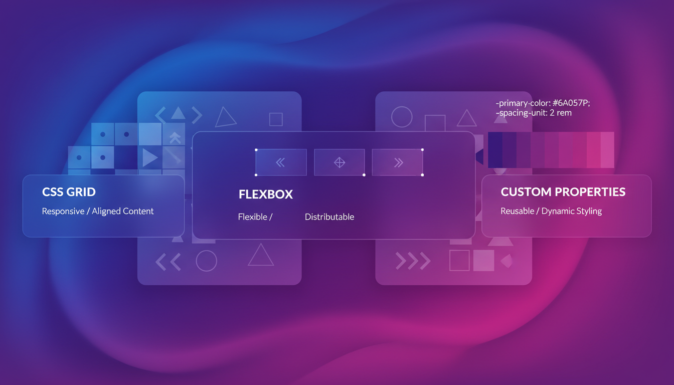
CSS Grid has revolutionized how we approach layouts. Unlike older techniques that were often hacky workarounds, Grid was specifically designed for complex two-dimensional layouts.
Here’s how I implemented the gallery section on my portfolio using CSS Grid:
.gallery-container {
  display: grid;
  grid-template-columns: repeat(auto-fit, minmax(300px, 1fr));
  grid-gap: 1.5rem;
}

@media (min-width: 768px) {
  .featured-item {
    grid-column: span 2;
    grid-row: span 2;
  }
}
The auto-fit and minmax() combination creates a responsive layout that automatically adjusts the number of columns based on the available space, without any media queries (except for the featured item treatment).
CSS Custom Properties for Theming
CSS Variables (Custom Properties) have changed how we handle theming and dynamic styling. Here’s a simplified version of how I implement theme variables:
:root {
  --color-primary: #0077cc;
  --color-primary-dark: #005fa3;
  --color-text: #333333;
  --color-background: #ffffff;
  --spacing-unit: 8px;
  --border-radius: 4px;
  --transition-standard: 0.3s ease;
}

.dark-theme {
  --color-primary: #3694ff;
  --color-primary-dark: #1a7fff;
  --color-text: #e0e0e0;
  --color-background: #121212;
}

.button {
  background-color: var(--color-primary);
  color: var(--color-background);
  padding: calc(var(--spacing-unit) * 2) calc(var(--spacing-unit) * 3);
  border-radius: var(--border-radius);
  transition: background-color var(--transition-standard);
}

.button:hover {
  background-color: var(--color-primary-dark);
}
This approach makes it trivial to implement theme switching, component variations, and even dynamic user preferences.
Container Queries: The Future of Responsive Design
While media queries look at the viewport size, container queries allow you to style elements based on their parent container’s size. This is a game-changer for component-based design:
.card-container {
  container-type: inline-size;
  container-name: card;
}

@container card (min-width: 400px) {
  .card-content {
    display: grid;
    grid-template-columns: 1fr 2fr;
    gap: 1rem;
  }
}

@container card (max-width: 399px) {
  .card-content {
    display: flex;
    flex-direction: column;
  }
}
With container queries, the same component can adapt its layout based on where it’s placed in the UI, not just the overall viewport size.
Modern CSS Reset
Every project needs a good CSS reset. Here’s my current approach that combines the best parts of modern CSS resets:
*, *::before, *::after {
  box-sizing: border-box;
  margin: 0;
}

html {
  height: 100%;
  font-size: 100%;
  -webkit-text-size-adjust: 100%;
}

body {
  line-height: 1.5;
  -webkit-font-smoothing: antialiased;
  min-height: 100%;
}

img, picture, video, canvas, svg {
  display: block;
  max-width: 100%;
}

input, button, textarea, select {
  font: inherit;
}

p, h1, h2, h3, h4, h5, h6 {
  overflow-wrap: break-word;
}
This reset provides a clean foundation without being too opinionated.
The Tailwind CSS Approach
While I appreciate writing vanilla CSS, I’ve found that Tailwind CSS significantly speeds up my development workflow. It provides a utility-first approach that keeps you in your HTML while still allowing for complete design flexibility.
Here’s how a button might look with Tailwind:
<button class="bg-primary hover:bg-primary-dark text-white font-medium py-2 px-4 rounded transition duration-300 focus:outline-none focus:ring-2 focus:ring-primary focus:ring-opacity-50">
  Click Me
</button>
The beauty of Tailwind is how it scales with your project. For my portfolio, I’ve extended the default Tailwind theme to include my brand colors and design tokens:
// tailwind.config.js
module.exports = {
  theme: {
    extend: {
      colors: {
        primary: {
          DEFAULT: '#0077cc',
          dark: '#005fa3',
          light: '#3694ff',
        },
        // other custom colors...
      },
      spacing: {
        // custom spacing values...
      },
      borderRadius: {
        // custom border radius values...
      },
    },
  },
  // other config...
}
Animation and Transitions
Subtle animations can significantly enhance user experience. CSS has powerful animation capabilities that don’t require JavaScript:
.card {
  transition: transform 0.3s ease, box-shadow 0.3s ease;
}

.card:hover {
  transform: translateY(-5px);
  box-shadow: 0 10px 20px rgba(0, 0, 0, 0.1);
}

@keyframes fadeIn {
  from {
    opacity: 0;
    transform: translateY(10px);
  }
  to {
    opacity: 1;
    transform: translateY(0);
  }
}

.fade-in {
  animation: fadeIn 0.5s ease forwards;
}
For more complex animations, I occasionally use libraries like Framer Motion, especially when building React components that need orchestrated animations tied to component lifecycle events.
Accessibility Considerations
Modern CSS should always include accessibility considerations. Here are some guidelines I follow:
- Use sufficient color contrast (minimum 4.5:1 for normal text)
- Don’t rely solely on color to convey information
- Ensure focus states are clearly visible
- Design for keyboard navigation
- Test with screen readers
For example, this focus style ensures visible focus indicators while maintaining design aesthetics:
:focus-visible {
  outline: 2px solid var(--color-primary);
  outline-offset: 2px;
  border-radius: var(--border-radius);
}
Performance Optimization
CSS can impact performance, so I follow these practices:
- Minimize unused CSS (PurgeCSS with Tailwind does this automatically)
- Use modern CSS features that are optimized by browsers
- Be mindful of expensive properties (like box-shadow and filter)
- Use will-change sparingly and only when needed
- Prefer transforms and opacity for animations (they’re GPU-accelerated)
Conclusion
Modern CSS has evolved from a simple styling language to a powerful toolset for creating responsive, accessible, and beautiful websites. By leveraging features like Grid, Custom Properties, and Container Queries, we can build more flexible and maintainable designs.
As I continue to evolve my portfolio site, I’m excited to explore emerging CSS features like :has(), subgrid, and nesting. The future of CSS is bright, and it’s never been a better time to be a front-end developer.
What modern CSS techniques are you using in your projects? I’d love to hear about your experiences and challenges.
Written by Dean Keesey